Melbourne Transit App
Spring 2016
About a year ago, I spend five months studying and exploring the lovely city of Melbourne, Australia. During my time there, Melbourne did not have adequate digital transit information. As a first time visitor in another country, this was very difficult for me and my friends. Rather than just complain, I saw this as an opportunity to use design methods, problem solving, and technology to solve a transit information issue.
What does a “transit app” in Melbourne Australia look like?
First, some background: Melbourne was built to be different, a grid, more organized than earlier Australian cities. The transit reflects it. Although we’d sometimes complain about it, as an American hailing from cities with archaic or nonexistent transit, Melbourne was something. An interconnected network of trains, trams, and buses take Melbourne residents out // and about // in the city // something about moving around. Therefore, my concept had to include these different modes of transportation, what they meant and what difference it made to take them. Maybe I could include different icons, like some apps do? Maybe I could use line weights and textures on a map?
Before I started designing, I needed more information. How do people feel about Melbourne transit? What are their current processes for getting from point A to point B? I needed field research.
Luckily I had some friends in the area who were willing to talk casually about their transit experiences and what they did in Australia. Although I would’ve liked to interview more, for this I only inferviewed a few friends. Then, I chose two of those people as inspiration and representations of problems to focus on. To visualize their experience, I quickly sketched “user journeys,” describing Rachael and Luke’s current transit experiences.
Luke’s journey is a daily use situation, he uses the internet application on his phone to find his timetable.Rachael’s journey involves her going to a new location and finding it using multiple apps.
After sorting out the experiences, I began sketching manually and digitally, using the digital sketches for the following user tests.
Since there were two different experiences, there were two different user tests. In the first, using invision, I created and tested the flow with three different individuals. I asked them to talk through what they saw on each screen and what they thought it meant. Then, I asked them to complete a task: how would you get to “Swinburne University” using this app? I had them talk through the process and give feedback throughout. It acted as both a design critique and a usability test.
The second experience test took a bit of a different, worksheet based approach. First, I set up the scenario, “Every day, you take train to school. You know that it takes you 15 minutes to walk to the train station and the train leaves about every 30 minutes, but, the train doesn’t always leave at the same time.” Then, I had printed, black and white screens that I put on the table, I had people choose which screen gave them the information they needed and asked them to explain why. Then I had them select “features” they liked out of all the different screens.
After the feedback, I created a site map to clarify and define the functionality of the app. It contains both scenarios and shows how they can work together.
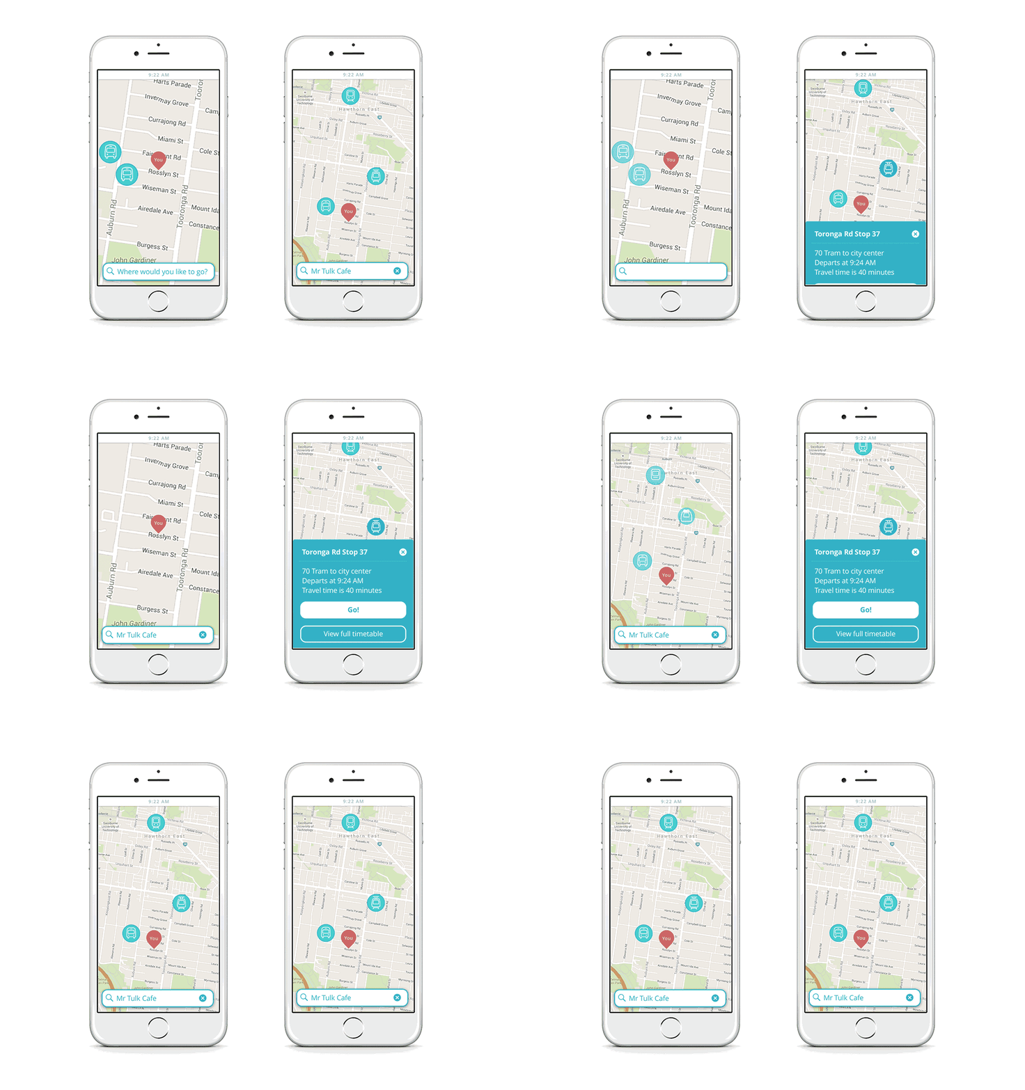
After sorting out the system, I created the visual design to tie all my research learnings together. I used sketch to quickly prototyping and design the final screens.
As an interaction designer, I can't make the transit faster, I can't make trains run on time, I can't make them run more often or be less crowded, but, as an interaction designer, I still have the ability to dramatically change people’s experiences.
View More Projects...


